So, there’s this wall in my living room. It’s going to be one of two ‘usable’ walls because of windows and furniture, etc. I love having lots of pictures on my walls and I finally decided that I would just fill this whole space up with framed photos of the kids.
So I used some string and tape and measured the space and repeated it on my floor. Then I rounded up all my picture frames. . . .
They totally don’t go together. I have a thing for picture frames, (geez, I have a ‘thing’ for lots of things, don’t I?!) and I pick them up when I find them on sale. Some are gold, some are silver, some are cream rubbed with gold, wood, painted wood, rhinestoned, bejeweled, you get the idea. I did use to have most of them displayed on my bookshelves in our last house. But they really don’t go together. I read something once about unifying a collection of things by painting them all the same color. That seemed like a good idea here! I’ve been seeing Rustoleum’s Heirloom White used all over blogland so I trusted other bloggers and picked some up. Now I know why everyone is using it, It. Is. Awesome. It’s a great creamy color and it covers SO MUCH BETTER than the other cream spray paint I had lying around.
So, I set everything up and got my handy dandy paint guy (hubby) to paint them for me. I did try to help, but Jay suggested I leave it to him. Something about drips. Hmph.
I didn’t get a ‘during’ pic, but here are some of my frames now.
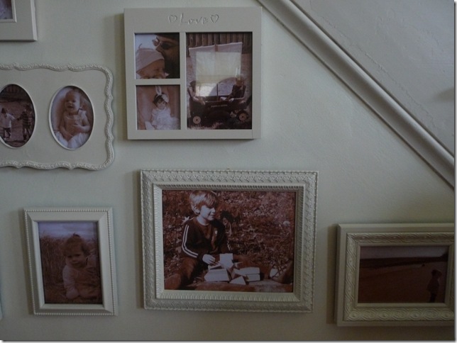
This frame turned out so well! It used to have a sort of funky/ethnic feel. It had turquoise and red and orange and yellow stones in a dark background. Totally not my thing at all, but I always liked it. Now I love it. It looks so unusual!
This one had sort of a faux wood finish and those dots were topaz colored stones. Not a very good color choice, actually. But the painted rhinestones give it a pretty cool texture now!
That large frame was really pretty. It was already cream and had a faded gold finish on the raised parts. It was hard for me to decide to paint it, but it really did turn out well! I’m really glad I did it!
More of the frames. You can see how they are all different textures and styles.
I love that one of Reese! That frame was hard for me to decide to paint too. It was really pretty. But again, I like it better this way too!
Ta da!!! (Please excuse the blue ‘devil box’, it’s on my list of things to do and I needed somewhere to put the satellite box. Oh, please excuse that too.) Looking at this picture, I can see I need to go straighten a couple of the frames with a level! I used a sticky mount adhesive on all of them to help keep them in place. Not all of the frames are meant to be hung. I affixed picture wire on them, but they still have that thingamajig that holds them up on a surface. That stupid thingamajig makes them not hang perfectly. But that foam adhesive helps balance them out and keep little hands from messing with them. I decided to use sepia photos. Some of those pictures have really, really great color, but it was just too chaotic looking. The big one of Amelia is a gorgeous blue and green and the one of Reese shows the breathtaking colors of fallen leaves in New England. And there’s quite a bit of pink in most of the other pics. So I again went with a unifying color and printed them all in sepia.
One more time. . . .
And after. . . .
Thanks for stopping by! I’m linking up with Susan at Between Naps on the Porch for Metamorphosis Monday! Can’t wait to see all the other great transformations!


8 comments:
Wow!!! That's so gorgeous! Love it!
That was a big project! I like how you mapped out the area on the floor. That was clever. I love the frames all the same color. Hmm, I think I love the pictures more than the frames.
You did a great job. It looks great!
Great job! That looks like it took a lot of patience. Thanks for showing how you did it. Definitely information I can use.
http://40daysof.wordpress.com/2010/04/19/new-art-and-guidelines-for-picture-hanging/
That turned out fantastic! I'm definitely gonna have to copy you now! And you can't do anything about it cause you moved all the way across the country. ;)
Wow, what a difference! Nice work.
Hello ~
You did a fantastic job - looks like it came out of a magazine !
Sorry, it took so long for me to come visit ( I work full time and it is hard to visit everyone in a timely manner) Anyway, you asked about ORB - it stands for Oil Rubbed Bronze - spray paint by Krylon - I can only find it at Walmart..Hope this helps :o)
Thanks for visiting !
Hugs ~ Kammy
This looks terrific. For some reason my google reader hasn't been letting me know when you have new post. So sorry I haven't been commenting more. you did a great job on this project!
Post a Comment